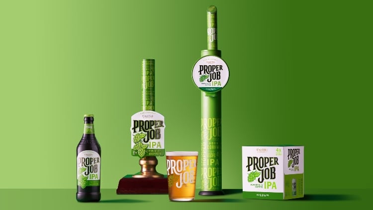
The family-owned company, which also operates more than 170 pubs, has evolved the brand in a bid to drive loyalty with its existing drinkers, as well as attracting a wider audience to the cask category.
The inspiration behind the rebrand was to “fuse heritage and heartfelt craft with relevance for today’s market”. St Austell said it features a striking new typeface and Proper Job’s iconic green is more prominent to maximise its stand-out credentials.
Changed significantly
New glassware, pump clips, fonts and tap handles – plus accompanying PoS – have been unveiled to support the relaunch.
St Austell Brewery’s marketing & communications director Laura McKay said: “Since the brand launched in 2006 the beer category has changed significantly, and it had been a little while since Proper Job’s look had evolved.

“Proper Job is a famous Cornish phrase meaning ‘a job well done’. Just like its name, we’ve spent over a year perfecting the beer’s new look and testing it with beer drinkers and fans of the brand.
“Our investment is all about honouring Proper Job’s loyal drinkers with a design that doesn’t stray too far from its roots, as well as reaching new audiences with its fresh look and feel – there’s absolutely no change to the much-loved IPA’s brewing recipe.”
Core cask brand
She continued: “We’re excited to be investing into one of our core cask brands, while unlocking further opportunities for the distribution of Proper Job in keg too.
“Proper Job isn’t about doing things differently, it’s about doing them right. We’ve carried this ethos throughout the rebrand and we can’t wait to see it come to life in pubs.”
Proper Job was one of the first IPAs to hit the mainstream beer scene in the UK in 2006 and has gone on to become a top 10 cask brand in the independent free trade, according to CGA data (P08 2023).


