New look for Bishop's Finger
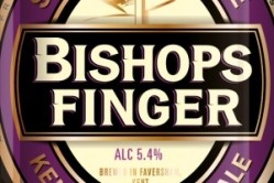
Bishop’s Finger, brewed by Faversham-based Shepherd Neame, will keep its traditional purple, gold and white colours, but has been given a new design which tells the story of its unusual name, which is taken from the Kentish nickname for an ancient finger-shaped signpost found only in Kent pointing to Canterbury.
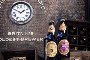
The new look also brings the brand in line with beers from the brewer’s Classic Collection, which includes its Double Stout and India Pale Ale brews.
“The rationale behind the new direction was to take the brand back to its heritage,” said brand manager Kate Maclean. “The packaging now communicates both the story of the sign that led the way for the Pilgrims and the history of Bishops Finger as one of Britain’s oldest ale brands.
“The new design very much brings it in line with our Classic Collection range to emphasise our Heritage, having all the traits of a traditional and premium product.”
The new pumpclips and bottles will be rolling out from this month.
Shepherd Neame launched two new beers last summer, and indicated there are more brews in the pipeline under its Whitstable Bay brand.
Bishop’s Finger was first brewed in 1958 as a celebratory beer.