The code rules
3.1 - The alcoholic nature of a drink should be communicated on its packaging with absolute clarity. A drink, its packaging and any promotional material or activity should not in any direct or indirect way:
3.2 - (a) give the higher alcoholic strength, or intoxicating effect, undue emphasis. A product’s lower alcoholic strength may be emphasised proportionately when it is below the average strength for similar beverages. Factual information about alcoholic strength may be given;
(b) suggest any association with bravado, or with violent, aggressive, dangerous or antisocial behaviour (though sponsorship of activities which may be dangerous after alcohol consumption, such as motor or yacht racing, are not in themselves in breach of this clause);
(c) suggest any association with, acceptance of, or allusion to, illicit drugs;
(d) suggest any association with sexual activity or sexual success;
(e) suggest that consumption of the drink can lead to social success or popularity;
(f) encourage illegal, irresponsible or immoderate consumption, such as drink-driving, binge-drinking or drunkenness;
(g) urge the consumer to drink rapidly or to ‘down’ a product in one;
(h) have a particular appeal to under-18s (in the case of sponsorship, those under 18 years of age should not comprise more than 25% of the participants, audience or spectators);
(i) incorporate images of people who are, or look as if they are, under 25 years of age, where there is any suggestion that they are drinking alcohol or they are featured in a significant role. Images may be shown where people appear only in an incidental context; or
(j) suggest that the product has therapeutic qualities, or can enhance mental or physical capabilities.
The Portman Group’s compliance manager Alistair Taylor, Steve Liverns from the British Beer & Pub Association (BBPA), Beavertown’s art director Nick Dwyer, as well as Trevor Townsend and Mike Willows from design agency Not On Sunday, discussed what beer artwork design rules mean for the craft beer industry and why restrictions don’t mean its time to can more creative label designs.
Not all illustrations will lead to complaints
Stressing that there were a “disproportionate” number of complaints citing alcohol labels from the craft sector, The Portman Group’s Alistair Taylor was keen to clarify basic guidelines for craft beer labels.
According to Taylor, brewers need to communicate “with absolute clarity” that a beverage is alcoholic rather than a soft drink on their can and bottle labels.
Taylor added that packaging “has to work hard” to leave the consumer in no doubt of what they’re purchasing, with a brand name and its position in the alcohol aisle of a supermarket deemed insufficient warning for a customer that what they’re purchasing is alcoholic in the eyes of regulators.
According to Taylor, rule 3.2 (h) relating to a design’s “particular” appeal to under-18s was one that brewers most regularly fell foul of, with the case of Tiny Rebel’s ‘Cwtch’ highlighted as a case study given it “looked too much like a soft drink, strong appeal to children”.
Taylor explained it was very rare that one aspect of a design made a drink problematic and highlighted that past rulings by no means meant that all illustrations would lead to complaints.
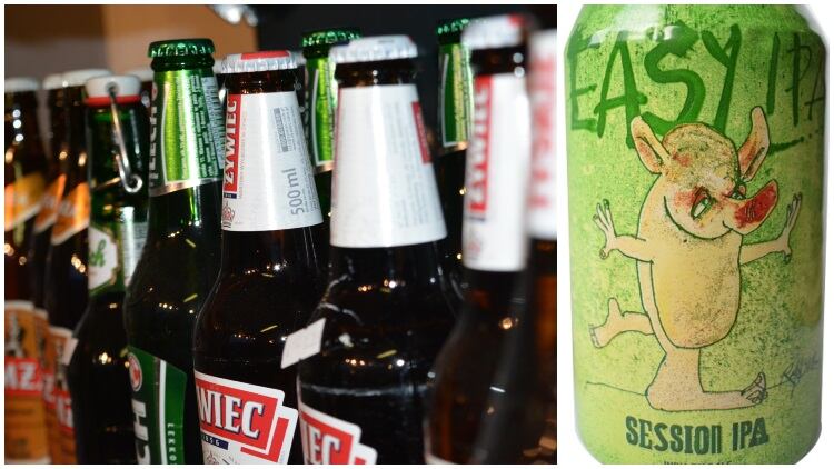
He explained that dark, adult, graphic novel-based designs, as well as retro or nostalgic illustrations, were regularly deemed compliant with regulations rather than cartoons including toilet humour or animals, which may have a stronger appeal to children.
More information on how brewers can ensure their designs don’t get canned can be found here.
Label requirements
Steve Liverns from the BBPA added that can designs have to make sure that consumers have “all the information they need at point of purchase to make that purchase”.
He added: “Make sure information is not only there but it’s clear. Information has to be written in a font that people can readily see.”
According to Liverns, can and bottle designs need to include the name of the ‘food’ – something that the customer will recognise as being representative of the product ie, a descriptor such as ‘beer’ – as well as ‘best before’ dates, the name of the business, brewer, packager or in some cases – determine where the product came from, the alcohol strength, the amount of beer in the container as well as allergen information in the ingredients list.
Liverns explained that given kegs and casks were most likely to be sold to businesses rather than consumers, they’re subject to different demands given the amount of information that could be included in accompanying paperwork, rather than on the container or product itself.
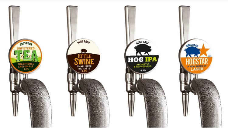
In terms of point-of-sale rules, Liverns stressed that the name of the ‘food’ needs to be there while allergen information needs to be readily available but not necessarily on the pump clip. In addition, he explained that ABV was not a legal requirement describing strength, ingredient information and nutritional declarations “voluntary”.
Rules don’t have to be stifling
Nick Dwyer, the art director of Beavertown explained that since joining the London-based brewer in 2012 he has seen can design change drastically and, ultimately, bar fridges become a lot more colourful as a result.
However, using the complaints made about the style of Beavertown’s Gamma Ray beer as an example, Dwyer explained that the regulations governing craft artwork presented exciting challenge rather than being purely punitive.
“When you’re designing you shouldn’t see limitations as a problem,” he explained, “you should try to embrace them, you can be really exciting within those limitations.
“Having complete freedom can be harder than having someone tell you where you can start and begin.
“Gamma Ray really encapsulates the cult following that it actually has. Meant to appeal to people who actually drink beer. It was at the front of a big wave. When we started doing Gamma Ray, beer was a lot more traditional. Far fewer colourful fridges.”
Dywer explained that the design of beers such as Gamma Ray – whose retro graphics he explained were heavily influenced by American breweries – were almost becoming as important as the beer itself in terms of driving the product forward among consumers.
Key areas
To round off the opening discussion of Craft Beer Rising 2019, Trevor Townsend and Mike Willows from design agency Not on Sunday – which designed Melissa Cole’s The Beer Kitchen book – highlighted vital, yet often overlooked, aspects of designing alcohol packaging.
Firstly, a collaborative approach was described as being “absolutely key”, with a good relationship between designer and brewer from the off deemed essential in conjuring a plan and, ultimately, fostering a creative environment.
Getting a design brief right was also explained as being central to the process. “We need to know what the vision and goal are,” Townsend explained. “We need to know so we can exceed your expectations.”
Townsend also explained that a brief should establish who the product’s audience is, put everything into context, and set out what values should be communicated in order to build a unique brand story.
Moreover, Townsend explained that attention to detail and often overlooked aspects of design such as font and how well a design translates from screen to can could make a huge difference to cost and shelf appeal.


