The race for space
These days it's not just in the property market that space is at a premium - the fight on the bar is almost as fierce, writes Adam Withrington.
You may not have noticed, but there is a war going on in Britain's pubs. No, it's not the battle of wills between the ciggie-waving pro-smoking league and the medical report-wielding anti-smoking lobby. Rather it's a strange battle for space on Britain's bar tops.
Major brewers are being accused of putting brand awareness ahead of the happiness of licensees by flogging ever bigger and brighter branded fonts on bar tops, limiting bar space and hiding bartenders from customers' view. There are licensees who have responded by installing T-bar systems (where multiple products are dispensed on one non-branded unit), surely the arch-enemy of any brand manager.
David Rollason, trade marketing manager for the Unique Pub Company - now part of Enterprise Inns - believes the big brewers have become too narrow-minded.
"Over the years the size of dispense fonts on bars has grown," he says. "There is almost a competition among the big brewers to have the most brand visibility and presence on the bar. Bar tops haven't grown in the last 10 years but bar fonts have and something has to give."
David Jones, spokesman for Scottish Courage whose brands include Foster's and John Smith's, believes publicans have never had it so good. "Licensees now have more choice than ever on dispense units. Tens of millions of pounds have been invested in technology and publicans can have whatever they want, even T-bars," he says.
However, Mark Barnett, sales manager of beer dispense manufacturer Courtenays, says: "We get a lot of feedback from publicans and they are sick and tired of massive, illuminated bar fonts that clutter up the bar. Some of these fonts are so big you can't see the bartender behind them. They are affecting the relationship with the customer as they lose crucial eye contact.
"Nobody wants them, licensees want short dispensers, like the Cube dispensers we designed for the Royal Exeter Hotel in Bournemouth (pictured). The brewers are not really listening to what the publicans are saying."
David Jones rejects this accusation. "Not listening would be the road to business suicide. We are constantly researching our offering with licensees and if someone has a problem with our fonts they can talk with us and get something different," he argues.
Despite this, some licensees are disgruntled at the growing size of bar fonts. Danny Scott, licensee of Rick's Bar in Greenwich, London, won't have big branded fonts in his bar. "They're intrusive and just too big," he says. "You only have so much bar space. I will only have T-Bars here and it's been like that for the last 10 years. Brewers do come round to try and get me to put in the big fonts but I'm not interested."
Richard Bradbury, on-sales director of Heineken, does have sympathy with licensees. "Perhaps big brewers can focus a bit too much on brand recognition and should put a bit more effort into looking at publicans' wishes," he concedes.
"Brewers have been guilty in the past of pretty horrendous bar font designs. So it's not surprising that some bar owners have reacted against this by bringing in their own fonts."
However, Mr Bradbury believes that the trend for T-bars and anonymous fonts is selling the industry short.
"I really think it is a shame," he says. "One of the arts of retailing is finding fresh ways of selling products to the consumer and beer has suffered as a result of these non-branded fonts. The more licensees go down the route of making beer products anonymous on a bar, the more it is detrimental to the beer category."
Family brewers
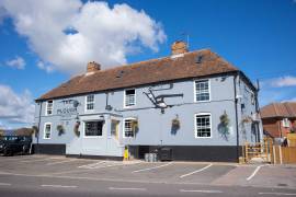
Shepherd Neame's policy on bar fonts is a refreshing approach to the problem. Chris McLean, licensee of Shepherd Neame pub the Plough and Harrow in Bridge, near Canterbury, says: "Shepherd Neame likes to give products that aren't its own as low a profile as possible on the bar. So something like Guinness is served on a low-level T-bar. But its own branding is not too big either. Some of these fonts in pubs now are so big they're tacky."
Why brewers want branded fonts
Holsten UK is relaunching Holsten Export with a new bespoke font design - something the company believes will help raise the profile of the product. The font includes a new creamer dispense tap, which allows a faster pour and produces a bigger head on the pint.
The marketing talk is that the new font will be "instrumental in communicating Holsten Export's brand values to the consumer". What does that mean? Ben Peters, director of marketing at Holsten UK, explains: "The trends towards impactful fonts is in line with consumer tastes and expectations.
"More effort and greater investment is being put behind font design because brewers are endeavouring to communicate a distinctive brand proposition and product quality.
"A striking and impactful font helps improve brand appeal to the consumer as well as increasing rate of sale."